New interface
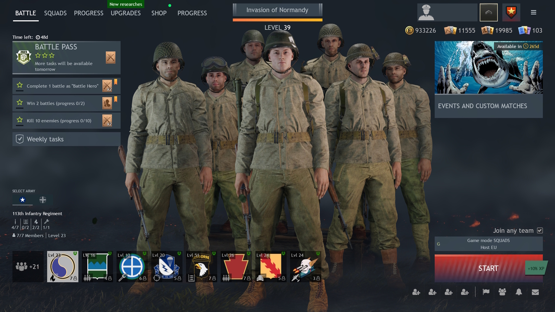
Many of you commanders discovered Enlisted more than two years ago. Every newcomer was invariably greeted by an ascetic main screen with the heroes of this game — your soldiers — and a set of basic options for training and equipping them.
Over the months and years, many things have changed. We simplified certain aspects, removed the academy, added a section for Battle Pass, promotions, events, and daily tasks, but Enlisted remained just as recognizable even if you returned to the game after a long break.
Today we're on the verge of big changes, and the first step toward one of them will be noticeable to everyone in an upcoming minor update. We are introducing a new interface.
The first step
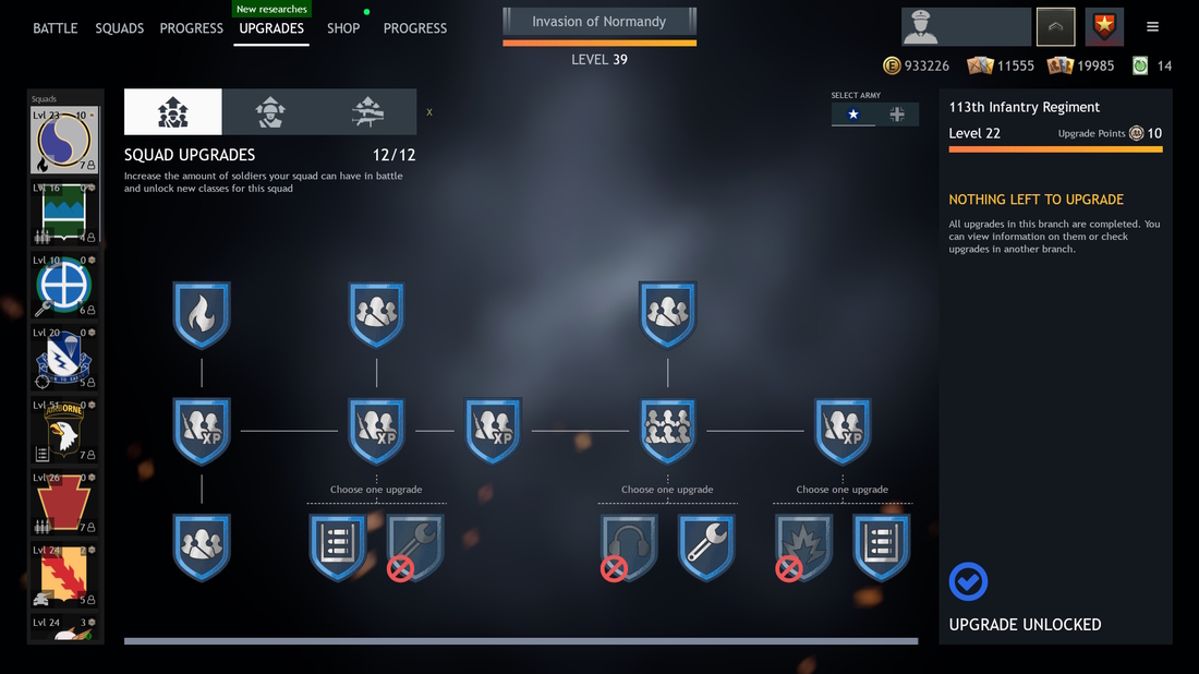
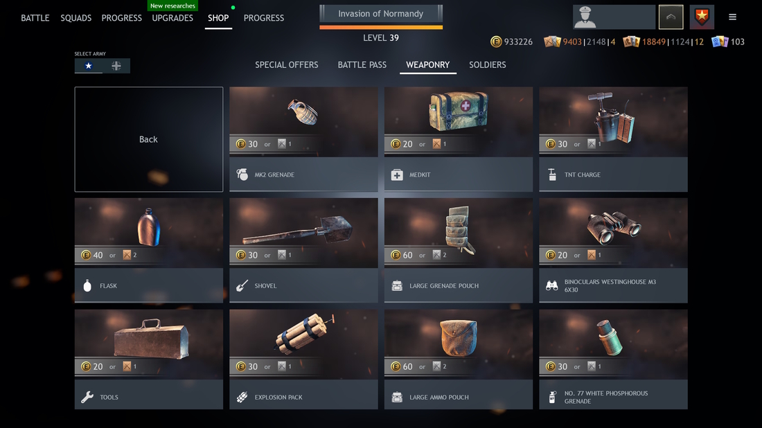
The tasks we had in mind when developing the new interface: to clean up the main screen and the store window due to the growing number of features, events and content, as well as to update the interface's appearance and prepare the game for a completely new metagame.
At the same time, this is the same old Enlisted — with your armies, upgrades, and all the mechanics you're already very familiar with.

With the introduction of the Research trees and other planned additions, the old interface just couldn't handle it. And that's probably one of the main, but not the only, reasons for the change.

Convenient navigation with gamepads and even keyboards, more logical menu sequences, improved weapon preview window, and just the personalization of all menus with the new style. We've even worked on optimizing the placement of active blocks — decluttered the main screen, which makes game events and tasks more noticeable. After all, what's a good game without regular events and promotions?

And, of course, this is in preparation for the major game update, in which the new interface for Research trees and soldier upgrade screens will be fully revealed.
Your feedback
This is the first stage of improving the interface. Things can change — things can get better. We're releasing the new interface at this stage of development to finish the process with you. Over the coming weeks and months until the major update to the Enlisted meta, we'll be collecting your feedback, improving menu logic, buttons, and even the color palette.
Leave your feedback directly in the comments of this news. We'll pin it long enough and we'll check it regularly.
